Australian football superstar and Matildas captain Sam Kerr has joined one of the world’s most exclusive luxury watch brands, reflecting on the sacrifices behind a career at the pinnacle of professional sport and revealing she only signed with her new club last week.
As Richard Mille’s first and only Australian partner, Kerr has joined an elite group of global athletes, artists and innovators associated with one of the world’s most prestigious watchmakers.
Speaking in Sydney, the 32-year-old reflected on her next chapter, the extraordinary growth of women’s football and the personal sacrifices required to reach the top of the game.
Founded in 2001, Richard Mille has built a reputation for producing some of the world’s most technically advanced and exclusive timepieces. The Swiss watchmaker is renowned for its use of ultra-lightweight materials, Formula One-inspired engineering and limited-production watches that often sell for hundreds of thousands of dollars and, in some cases, more than $1 million.
Its ambassadors include tennis great Rafael Nadal, Formula One stars Charles Leclerc and Lando Norris, actress Michelle Yeoh and sprint champion Shelly-Ann Fraser-Pryce.
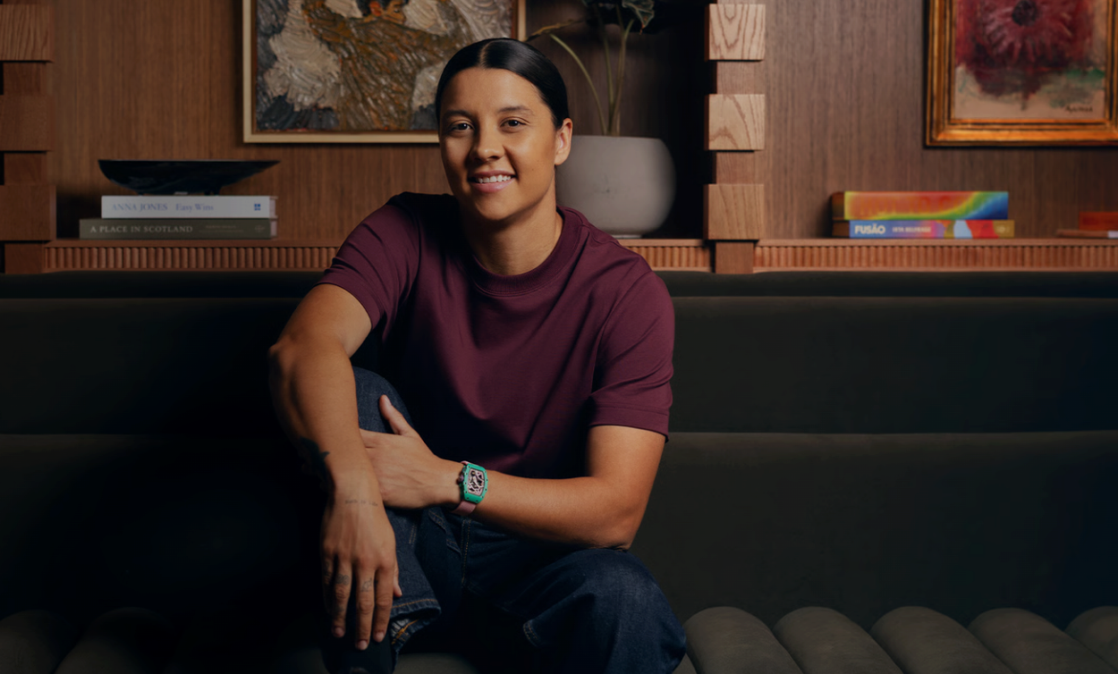
During the Sydney event, Kerr wore the Richard Mille RM 07-04 Automatic Sport, a lightweight model featuring a pink case, blue strap and skeletonised movement. Designed for active lifestyles, the watch reflects the brand’s philosophy of combining high-performance engineering with luxury craftsmanship.
For Kerr, becoming the brand’s first Australian partner is a source of considerable pride.
“Of course, being the only Australian is incredible to me,” she said. “I am very proud to be Australian and I like to put Australia on the map.”
The announcement comes as Kerr prepares for the next stage of her football career following her departure from Chelsea after six-and-a-half years.
While speculation around her future has been mounting for months, Kerr revealed a decision was only finalised recently.
“Everyone thinks that it was decided and I’ve known that (it was) reported that I’d signed somewhere in April, but honestly, I only signed my contract on Wednesday last week,” she said.
“I really hadn’t decided what I was going to do until last week.”
Kerr said she expects details of her new club to be announced around the beginning of July once her Chelsea contract officially concludes.
Despite her excitement about what lies ahead, she admitted leaving one of the world’s biggest football clubs has been emotional.
“I am really sad about it,” she said. “It’s been my home for 6.5 years. I have so many good memories there. I have so many amazing teammates. I’m sad to leave.
“It sucks to leave such a big club like Chelsea too, but it comes to an end to everything, right?”
The 32-year-old also reflected on the transformation of women’s football during her career, describing the Matildas’ rise from relative obscurity to household-name status as one of her proudest achievements.
“What the Matildas have done over the last four or five years has been incredible,” she said.
“The most important thing for me is that you leave the game in a better place.”
Kerr noted that when she began playing, there were few professional pathways for women, limited sponsorship opportunities and crowds that bore little resemblance to those regularly attending matches today.
“We are a part of that generation that still knows what it was like when there was no one in the crowd,” she said.
Today, she said, crowds of tens of thousands remain something the team never takes for granted.
“Even last night we had 20,000 on a Tuesday night nearly. That’s special to us,” she said.
“We feel very lucky that people come out and spend their money and come to a game and watch us.”
Yet behind the accolades, sponsorships and sold-out stadiums, Kerr said there have been significant personal sacrifices.
“I’ve been living out of home since I was 17 years old. I’ve missed a lot of my family’s life,” she said.
“I’ve missed a lot of weddings. I’ve missed funerals. I’ve missed so many things that people don’t see.”
Kerr revealed she was unable to return home for her grandmother’s funeral last year because of football commitments.
“You have to love what you’re doing. You have to want to sacrifice,” she said.
“Everyone makes sacrifices, of course, and what I do is a massive privilege, but there comes a lot of sacrifice with it.”
Away from football, Kerr said Australia remains central to her identity despite spending much of her adult life overseas.
“I think we take for granted in Australia the beaches, the ocean, the open spaces,” she said.
As she prepares for a new club, a new season and a new role with Richard Mille, Kerr said she remains motivated by the same passion that first drew her to the game as a teenager.
“It was really organic,” she said of her relationship with the luxury watchmaker.
“It’s a real family brand.”


 3 min
3 min